Phenotype Data Component Documentation
The Phenotype Data Component is a comprehensive tool designed for visualizing and analyzing phenotype data through a variety of plot types, including regression plots, scatter plots, heat maps, box plots, histograms, density overlay plots, rain cloud plots, violin plots, bar charts, and line plots. This component supports advanced functionalities such as filtering options, complex queries with logical operators, hover information, real-time updates, and data splitting based on experimental factors. It enables researchers, plant breeders, and scientists to explore, filter, and compare phenotypic data effectively, providing deep insights and supporting informed decision-making. The interactive and real-time features enhance data exploration, facilitate collaboration, and aid in the presentation of research findings.
Available Plots
The Phenotype Data Component supports the generation of various types of plots to visualize data comprehensively:
-
Regression Plot
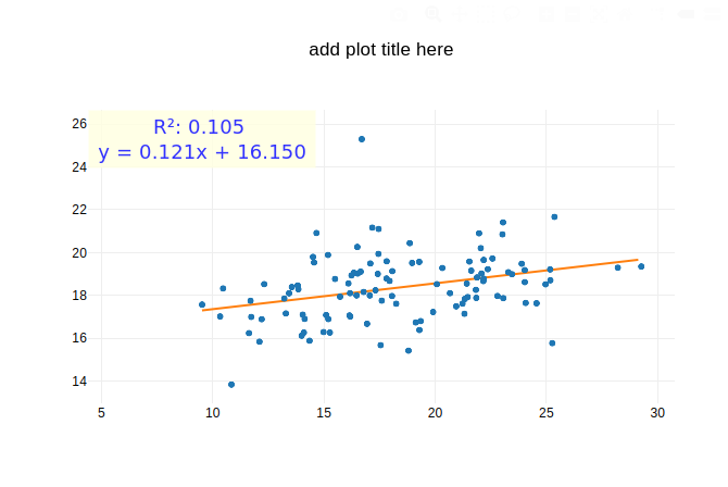
- Displays the relationship between variables using regression analysis.
-
Scatter Plot
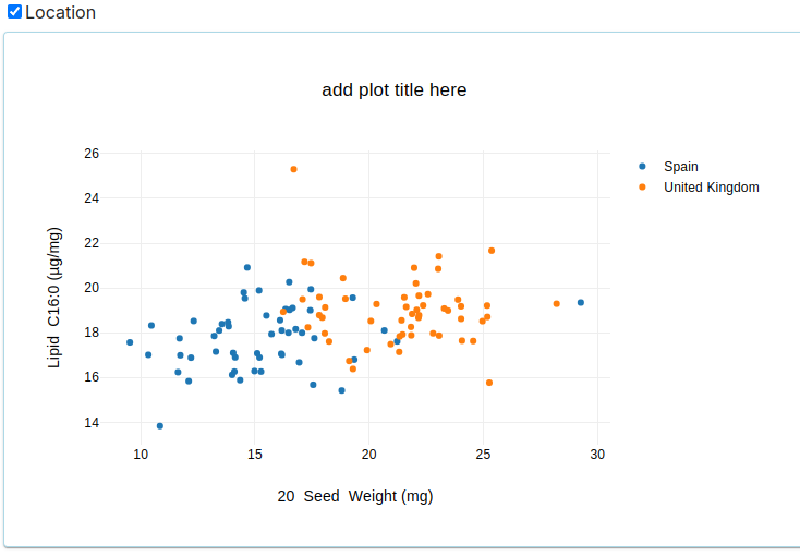
- Plots individual data points to show the distribution and relationship between two variables.
-
Heat Map
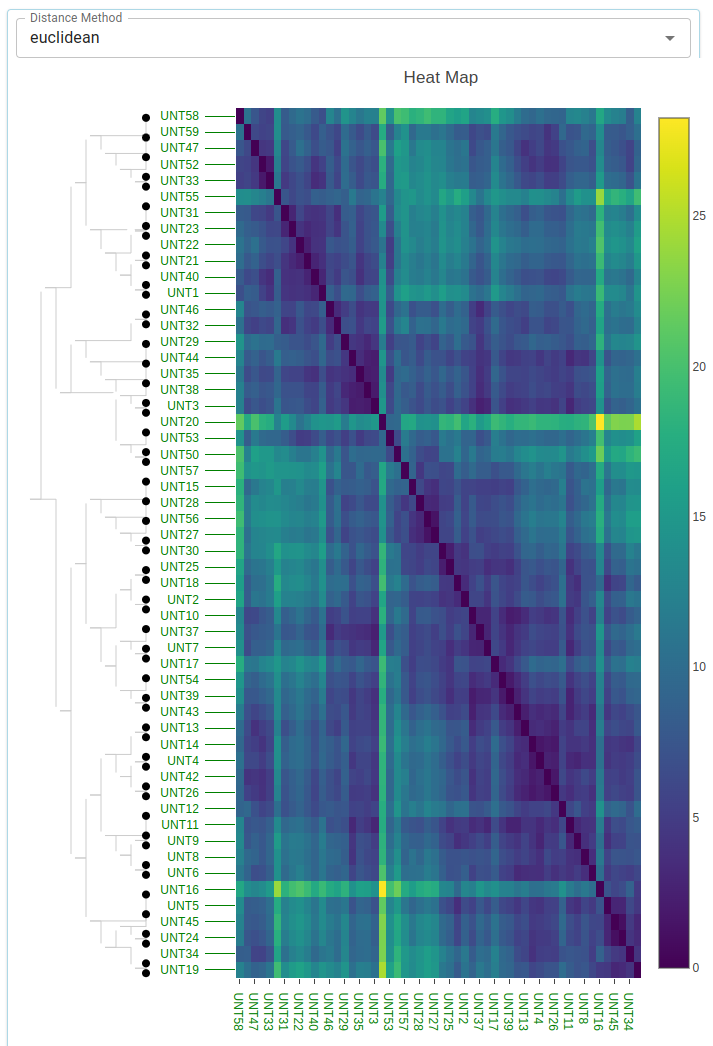
- Uses color to represent data values in a matrix format, useful for visualizing data density and patterns.
-
Box Plots
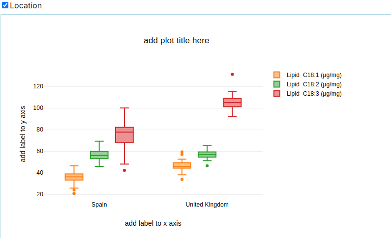
- Shows the distribution of data based on five summary statistics: minimum, first quartile, median, third quartile, and maximum.
-
Histogram
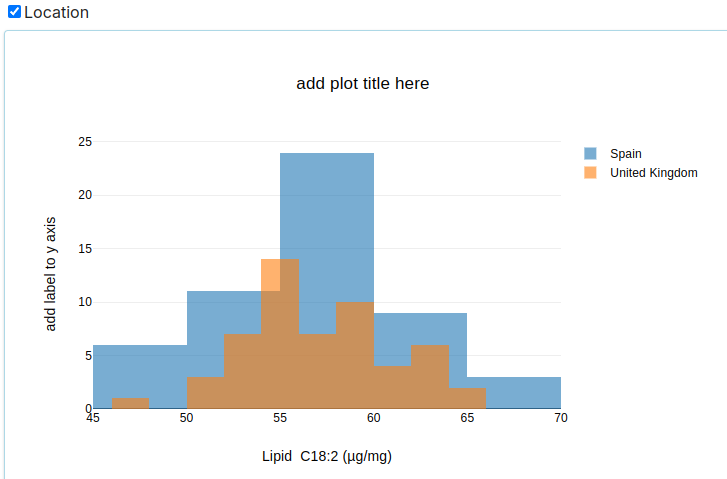
- Represents the distribution of a single variable by dividing the data into bins and counting the number of observations in each bin.
-
Rain Cloud Plot
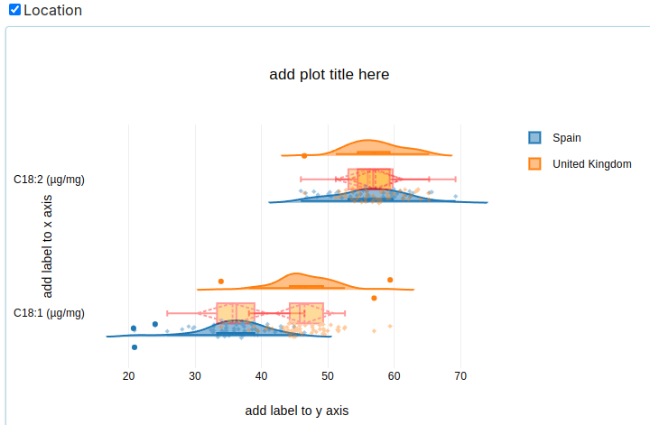
- Combines a density plot, box plot, and scatter plot to provide a comprehensive view of the data distribution.
-
Violin Plot
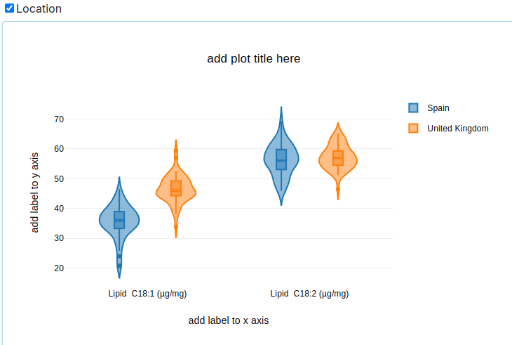
- Similar to a box plot, but with a rotated kernel density plot on each side to show the probability density of the data.
-
Bar Chart
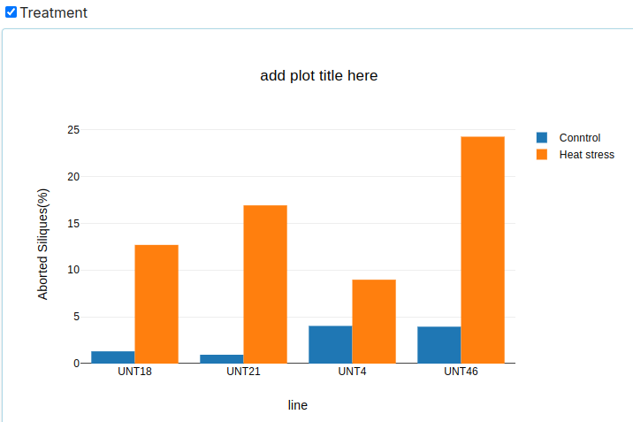
- Uses bars to represent the frequency or value of different categories.
-
Line Plot
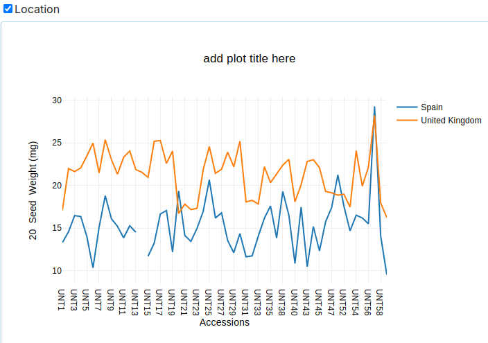
- Displays data points connected by lines to show trends over time or categories.
Key Functionalities
1. All Possible Comparisons or Variables
The component allows users to generate plots comparing all possible combinations of variables, providing a comprehensive view of the data.
2. Filtering Options
Users can filter data based on specific criteria to focus on relevant subsets of the data. Filters can be applied to any variable.
3. Complex Queries with Logical Operators
The component supports complex queries using logical operators (AND, OR, NOT) to refine the data selection process.
4. Hover Info
Interactive plots provide additional information when users hover over data points, making it easier to understand the details of each observation.
5. Real-Time Update
The component updates plots in real-time as users interact with the data, apply filters, or change settings, ensuring the latest information is always displayed.
6. Splitting Data Based on Experimental Factors
Users can split data into groups based on experimental factors such as treatment, genotype, or environmental conditions, allowing for comparative analysis.
Importance for Stakeholders
Researchers
- Data Exploration: Researchers can explore complex phenotype datasets, identify patterns, and generate hypotheses.
- Visualization: Various plot types help in visualizing data from multiple perspectives, aiding in better understanding and communication of results.
- Analysis: Advanced functionalities like filtering and complex queries enable detailed analysis and discovery of significant insights.
Plant Breeders
- Trait Comparison: Breeders can compare phenotypic traits across different genotypes or treatments to identify desirable characteristics.
- Selection: Visual tools assist in selecting the best-performing lines based on phenotypic data.
- Decision Making: Real-time updates and interactive plots support informed decision-making in breeding programs.
Scientists
- Research Validation: Visualizing data helps in validating research findings and ensuring data integrity.
- Collaboration: Interactive and shareable plots facilitate collaboration among scientists by providing a common platform for data exploration.
- Publication: High-quality visualizations are essential for presenting research findings in scientific publications and conferences.
Conclusion
The Phenotype Data Component is an indispensable tool for visualizing and analyzing phenotype data. Its extensive range of plots and advanced functionalities provide users with the flexibility and power needed to explore, filter, and compare data effectively. By leveraging this component, researchers, plant breeders, and scientists can gain deeper insights into their data, leading to better research outcomes and informed decision-making.